Valuation Chart Packet Published on October 8, 2025
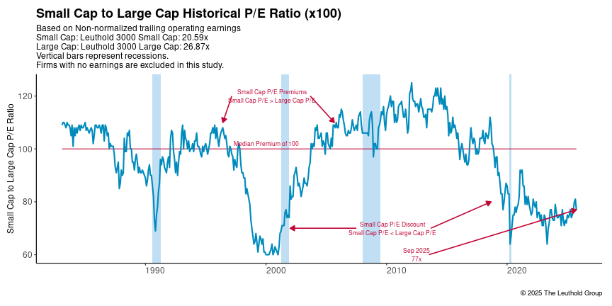
Leuthold 3000 Small Cap non-normalized trailing operating earnings vs Leuthold 3000 Large Cap non-normalized trailing operating earnings.
- PDF for printing
- PNG for use in an e-mail or on a website
- EMF for use in Microsoft Office applications
- CSV for data used in the chart
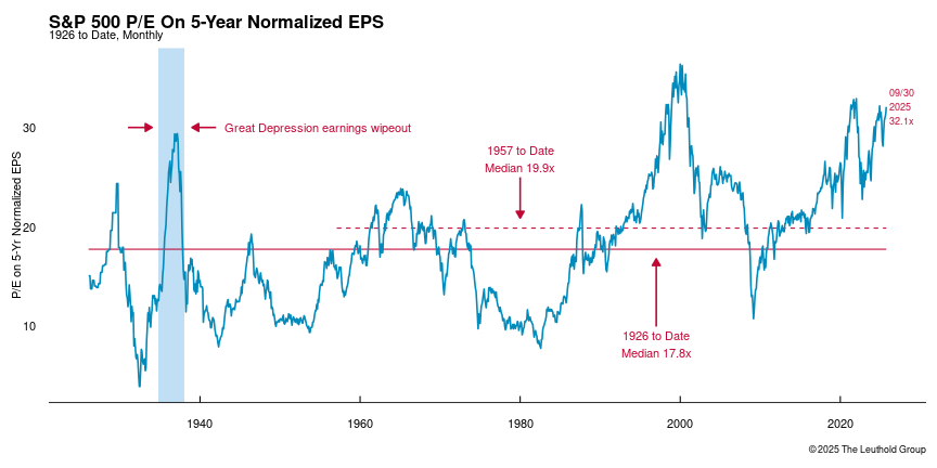
Five-year arithmetically averaged annual earnings, looking six months ahead and 54 months back. Adjusted earnings are the mid-point between reported and operating earnings
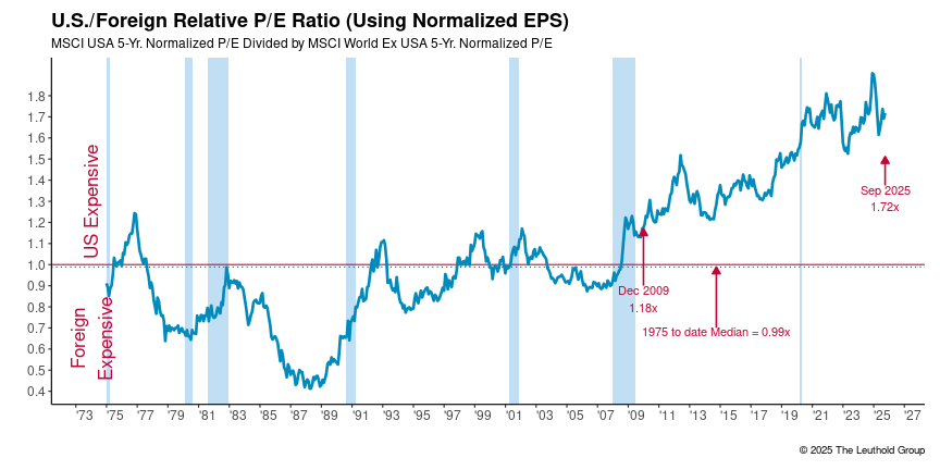
MSCI USA 5-year normalized P/E divided by the MSCI World Ex U.S. 5-year normalized P/E. The ratio is distorted in the late 1980s by the Japanese market bubble.
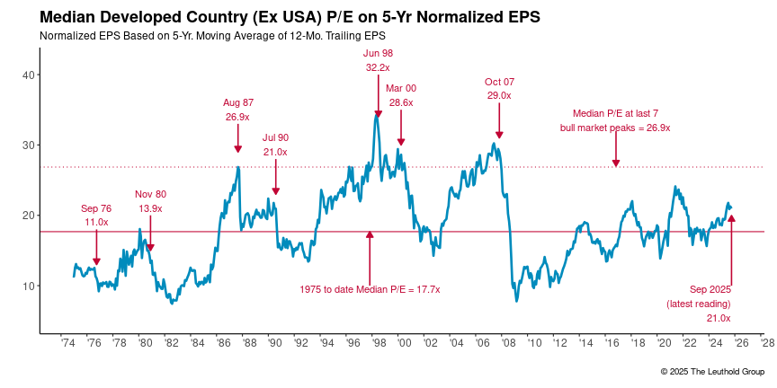
MSCI developed country median normalized price to earnings ratio using 5-year normalized EPS. The chart includes historical bull market peaks, overall median, and median of bull market peaks.
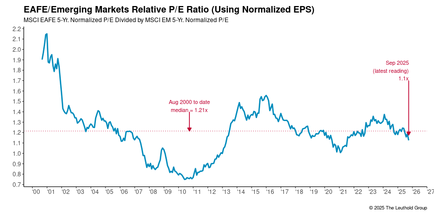
MSCI EAFE vs MSCI EM price to earnings using 5-year normalized EPS.
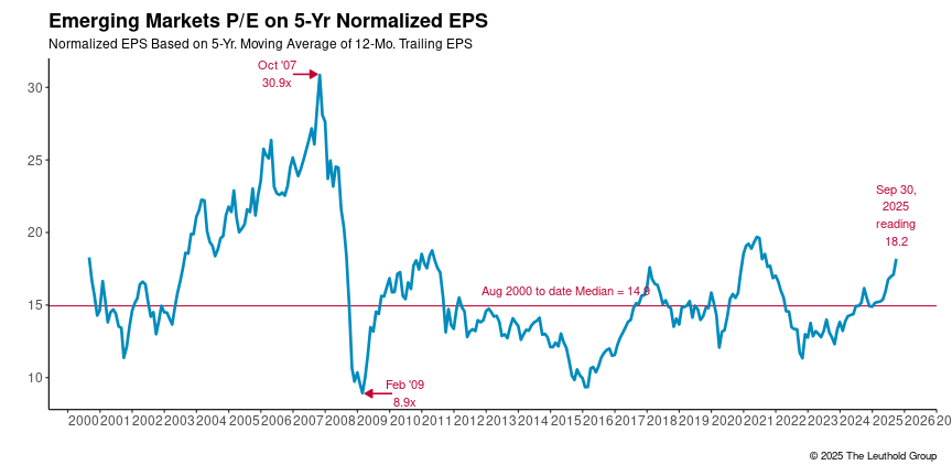
MSCI Emerging Market price to earnings ratio using 5-year normalized EPS. Since the October 2007 peak and subsequent trough in Feb 2009, the EM Normalized P/E ratio has been range bound.
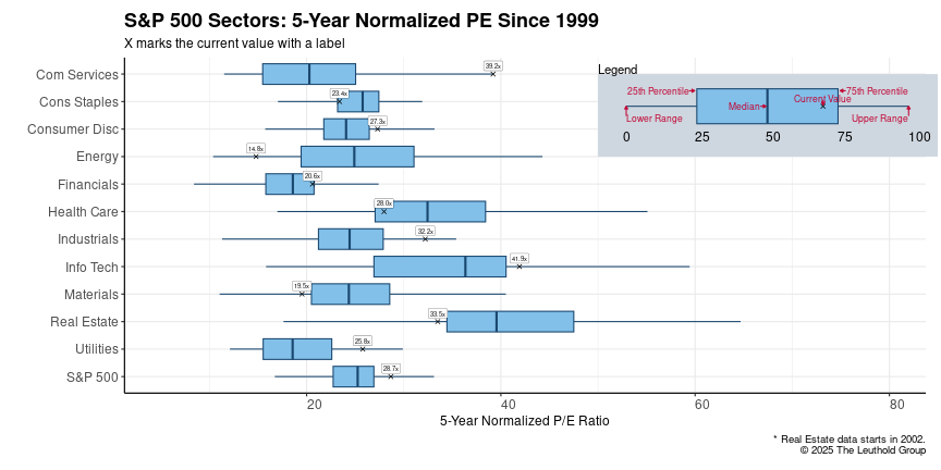
S&P 500 Sectors: Normalized P/E Ratios on a boxplot to show the quartile distribution of historical values as well as the current value. The whiskers on the box plot show 1.5x the 1st and 3rd quartile range. Data outside the whiskers are considered outliers.
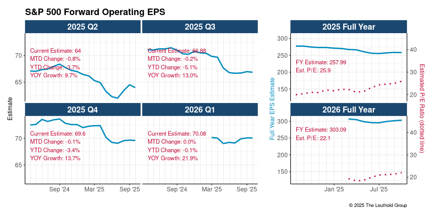
S&P Earnings Estimates by Quarter and Full Year over the past year.
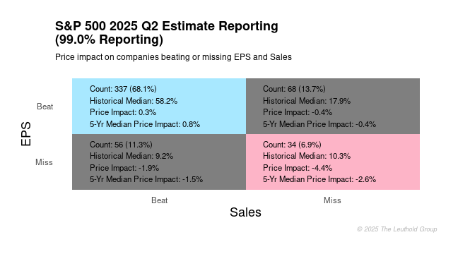
This plot has four quadrants that represent the potential scenerios of a firm beating or missing their earnings and sales estimates and how that impacts the price return.
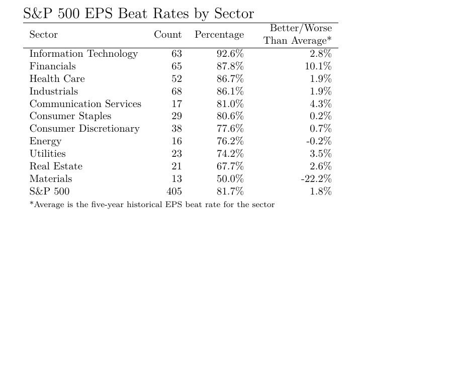
Estimates Sector Rankings
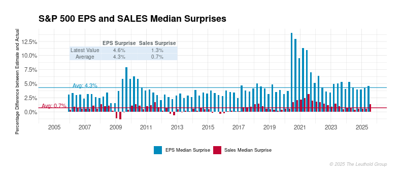
Long term history of earnings and sales surprise data along with the historical averages.