Economic Chart Packet Published on October 8, 2025
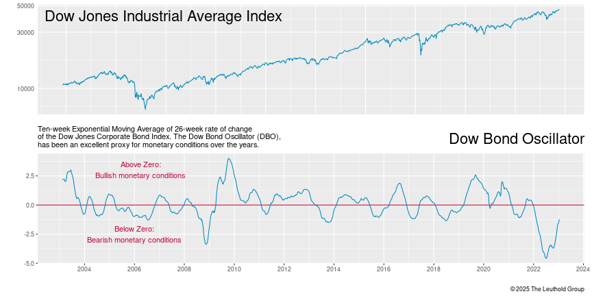
The Dow Bond Oscillator (DBO), a smoothed rate-of-change in corporate bond prices, has been an excellent proxy for monetary conditions over the years.
- PDF for printing
- PNG for use in an e-mail or on a website
- EMF for use in Microsoft Office applications
- CSV for data used in the chart
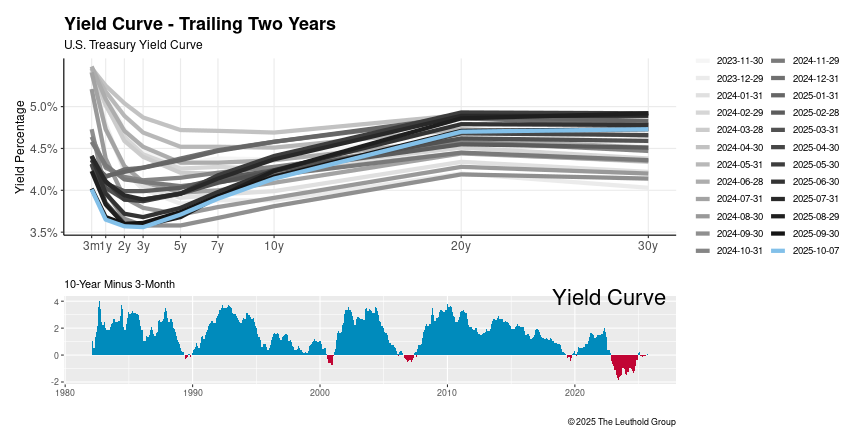
The yield curve inversion reflects supply/demand dynamics, expectations of further Fed tightening and unwinding of short strategies by speculators.
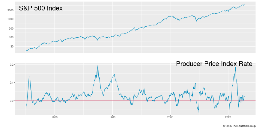
12-Month rate of change of monthly producer price index - finished goods
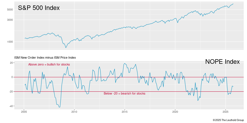
Institute for Supply Management New Orders minus Manufacturing Prices index
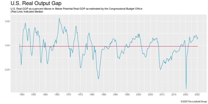
The percent difference between the current level of real GDP and its estimated potential level if the economy were operating at full employment and utilizing all resources
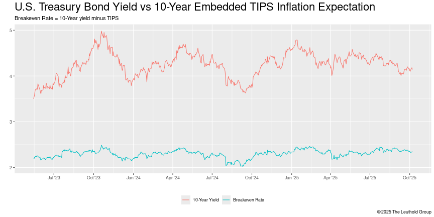
U.S. Treasury Bond Yield vs 10-Year Embedded TIPS Inflation Expectation
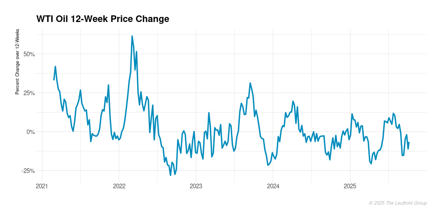
Changes in oil prices can be indicative of broader economic trends. Rising oil prices may suggest increased demand for energy, which can be associated with economic growth. Conversely, falling prices may signal reduced demand and potentially slower economic activity.
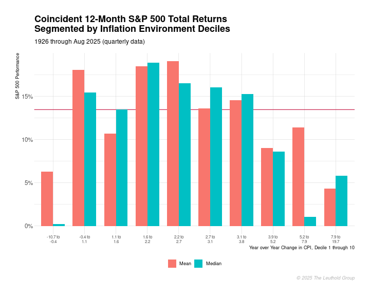
The chart illustrates the 12-month forward return of the S&P 500 index across different inflation deciles. Each decile represents a grouping of inflation levels, ranging from the lowest to the highest. Overall, the chart offers a visual representation of how the S&P 500's future returns have historically behaved across different inflation environments, helping investors better understand the relationship between inflation and stock market performance.
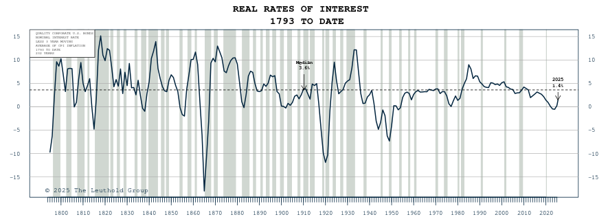
Real Rates of Interest (1793) Over Time. This calculation takes the quality corporate U.S Bonds nominal interest rate less the three-year moving average of CPI Inflation. Real interest rates represent the inflation-adjusted return on investment and provide insight into the true purchasing power gained or lost by holding a bond.
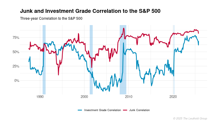
Understanding the correlation between bonds and the S&P 500 is vital for assessing portfolio risk, as it reveals how different asset classes behave in relation to equities. High correlation with the S&P 500 suggests that bonds, particularly junk bonds, may not offer diversification benefits during market downturns. Monitoring these correlations helps investors make informed decisions about asset allocation and risk management, especially in varying economic conditions.
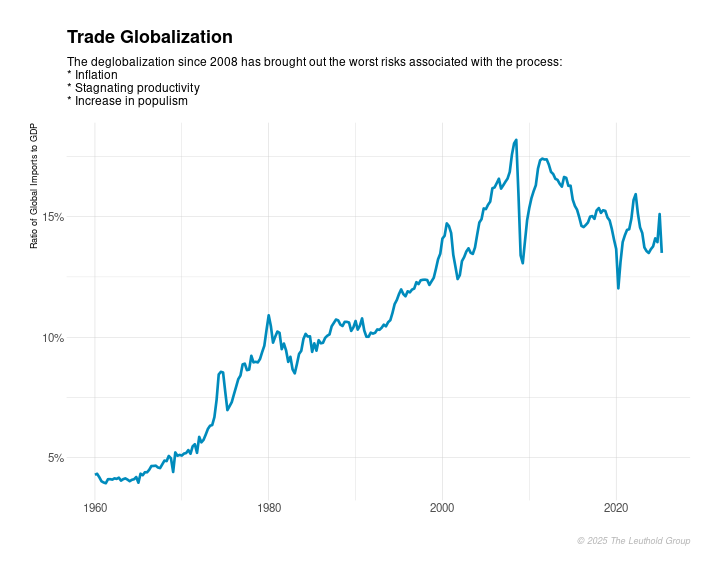
The current downward trend in globalization presents both challenges and opportunities for the U.S. Whether this trend will reverse depends on how technology evolves, the policies that are implemented, and the broader geopolitical landscape. It’s likely that globalization may not disappear entirely but could evolve into a new form that is less dependent on physical trade and more focused on digital and regional integration.
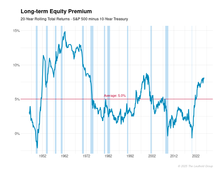
The chart displays the 20-year rolling return difference between the S&P 500 and the 10-year Treasury total return. It highlights the long-term relative performance of equities versus bonds, providing insights into how the risk premium of stocks over bonds has evolved over time. Peaks and troughs in the chart indicate periods where either equities or bonds outperformed the other on a 20-year basis.